
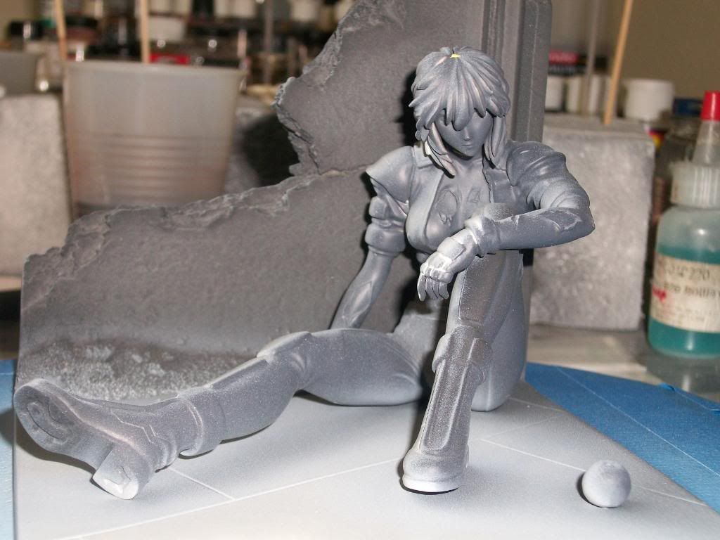
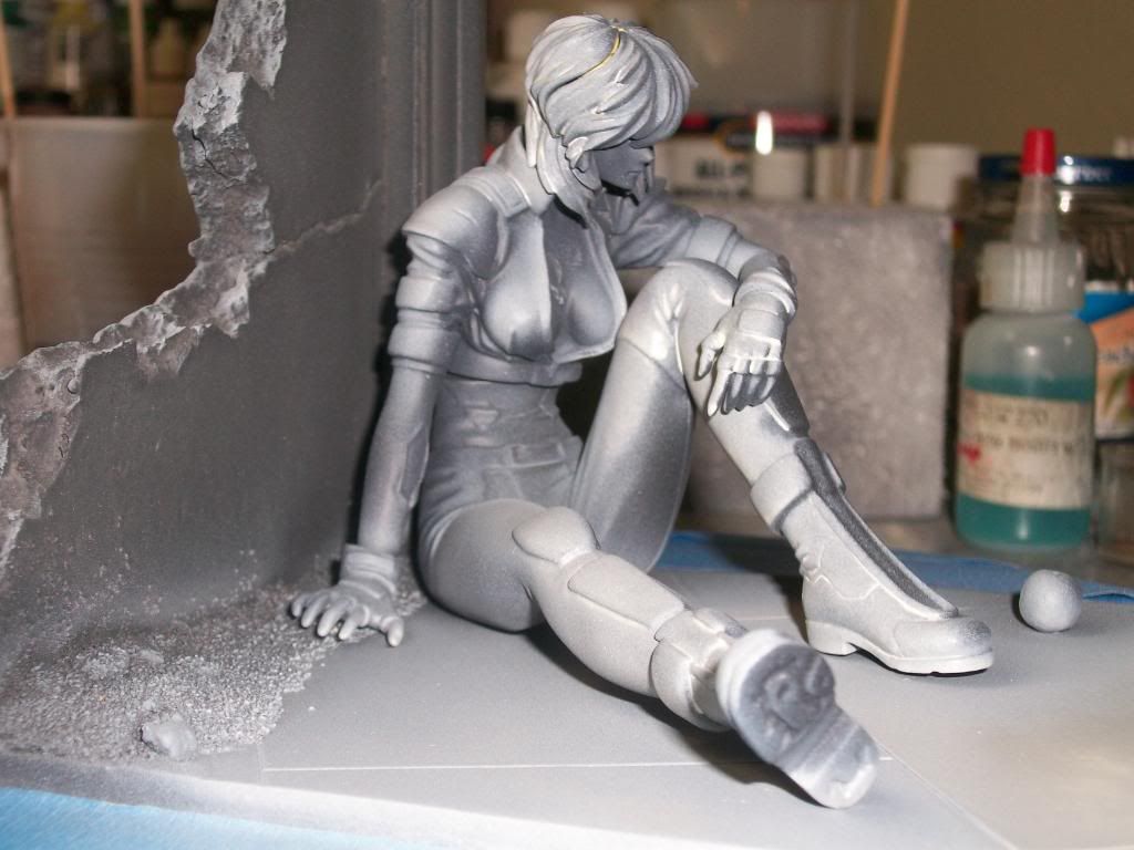
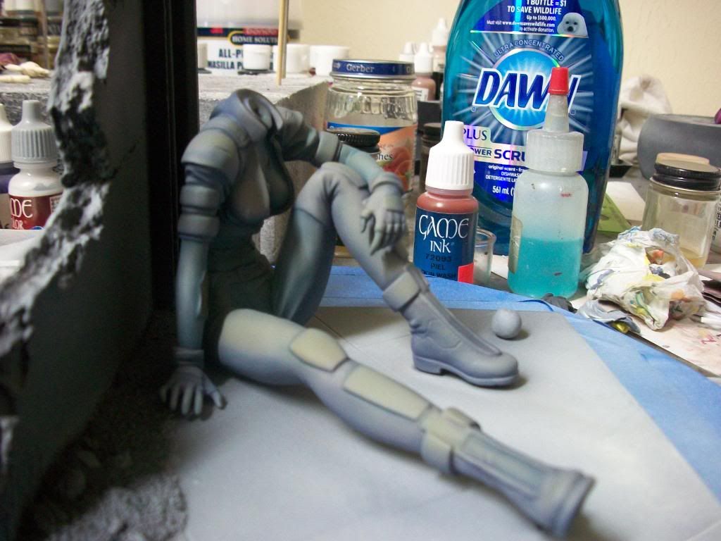
I primed all pieces in black and then sprayed a light white with a yellow tint from the direction that the sun would be shining on her so that I could get a general idea of where the highlights and shadows might fall. The next two pictures show Motoko from the viewer’s side first and then the highlighted side. Please notice the shadows cast by her leg, boot, and apple.
I next base coated the colors of her uniform. The research I completed on the character found her attired in a light grey and dark grey uniform. I amended the color scheme and used Intermediate blue and a warm grey color. A color wheel was used to select a color triad so that all of the colors would look well together. The plan was to use a blue/ purple color of uniform, pale green wall, and red apple as the primary colors of the triad. I applied a purple acrylic ink to the recesses of her uniform as pre-shading to the base coat. Even though acrylic ink dries, when moistened, either by water or paint, it reactivates and tints the applied color. The following picture shows the figure masked with silly putty and the ink applied prior to the application of the Medium Grey.
The next picture shows the uniform basecoat after the Silly Putty has been removed. Notice that the white pre-shading successfully defined the areas of highlight and shadow without me having to do further highlighting/shadowing on the coat. The pre-shading also defined where the highlights and shadows would be in relationship to the sun setting behind the wall.
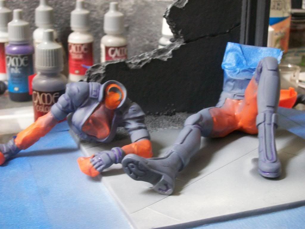
The next step was to simulate the sunset on her uniform. To accomplish this, pastel chalk was used. The setting sun casts a warm colored glow to objects that it strikes and cast shadows that are of cooler colors. Shadows where applied first with pastel chalk in a variety of dark blue and purple hues. Then the highlights were added using chalk of light yellow, orange-yellow, and orange to simulate the warm range of light as it strikes an object. Chalk has transparent properties so it acts as a tint of the base color which influences the base color hue. Pastel chalk was scraped off of the chalk sticks, applied with a paint brush, and then blended with a flat brush. Once the desired affect was achieved, the pastel chalk was sealed with a light coat of Testor’s Dullcoat. The following two pictures show the end result of the calk process on the figure.
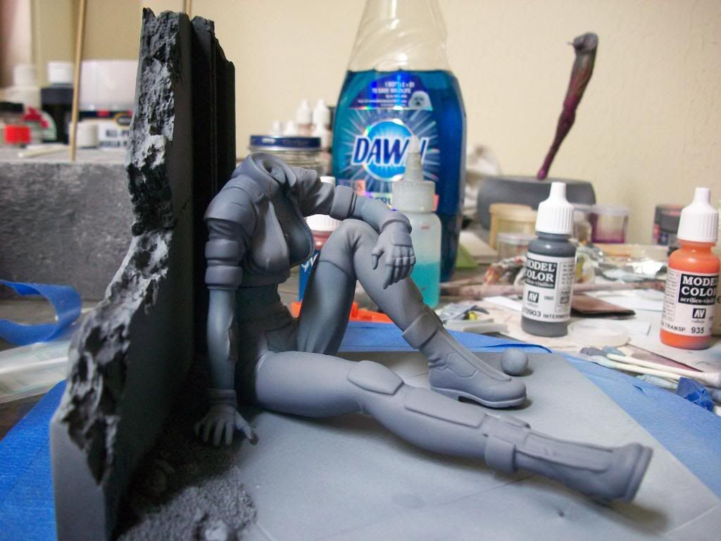
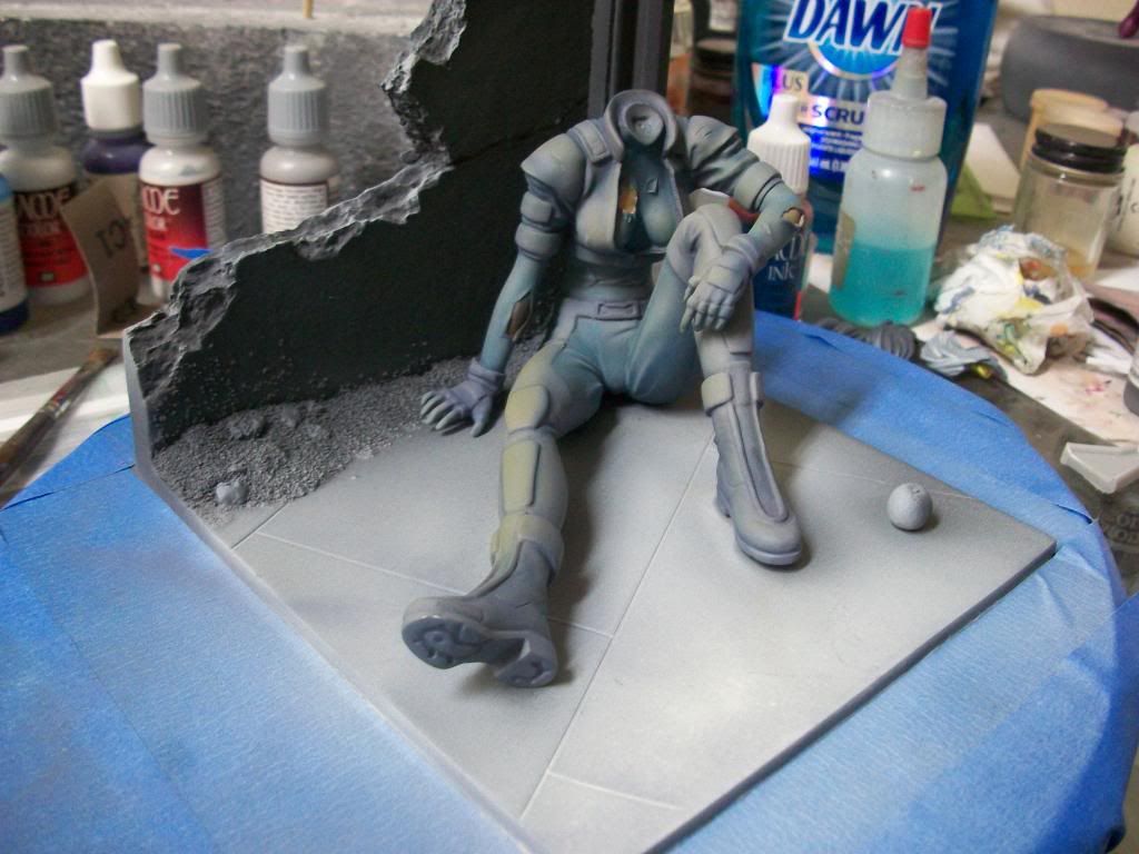
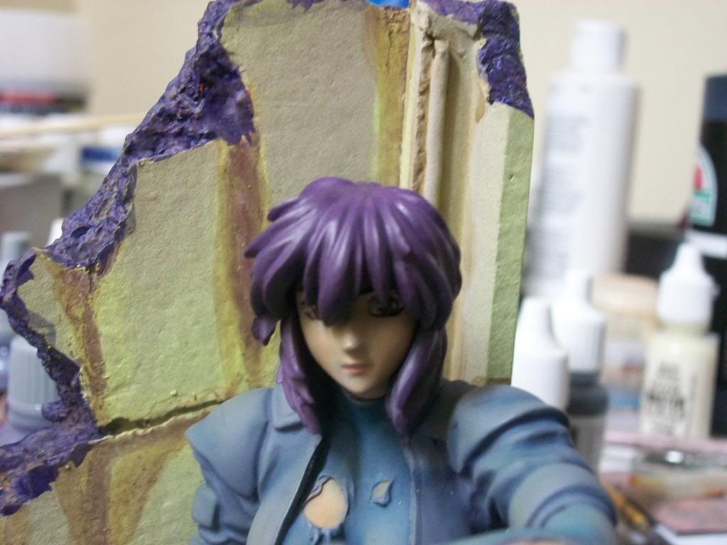
The next step was to work on the wall and floor. I painted the wall a light green to accentuate the peaceful mood of the piece and as one of the triadic colors with the blue/ purple color of her uniform. It was applied over a Dark Orange-Red color and hair spray was applied over the darker color once it had dried. The dark red color was used to bolster the mood of violence and war that was peaking behind the moment of peace experienced by the character and is the third member of the color triad. The green was removed in areas, simulating the wearing of the paint due to water drainage on this broken down wall; revealing the reddish paint below. Sepia ink was applied to represent water stains and show the course of water as it fell over the wall. The floor was painted Medium Grey to represent a concrete floor. The picture below shows the completed wall with the figure sitting in front.
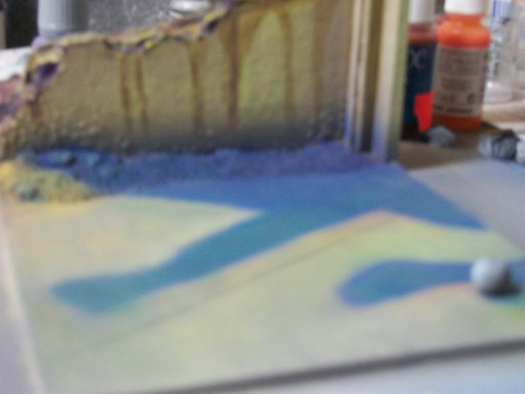
The next step was to render the highlights and shadows on the floor and wall. Shadows on the wall were completed by adding red to the green mixture, dulling in down, and spraying a pattern on the wall to represent shadow. I left the area directly behind the figure fee of shadow. A lighted figure reflects light which would fill in the darkness behind the figure. Visually, I wanted the wall to act as a kind of halo around the figure so the figure would pop out of the piece. I then took a high intensity light and directed over the wall toward the figure and quickly sketched where the shadows fell. The same sets of pastel chalks used on the figure were applied to the floor. It was important to continue the theme on the floor so that a context would be supplied for the shading of the figure. The shadow cast from the figure, however looked too dark, so I added green to the shadow to create a teal color that softened the shadow some. The round object by her foot is an apple. I don’t know the importance of the apple, but it seems to be something that is common for this character. It also needed to cast a shadow. The next picture shows the base highlighted and shadowed using the above process. Please excuse the blurry picture. This process on the base took approximately 45 minutes to complete, which does not seem like a very long time when compared to the amount of time I spent working on cleaning up seams. In fact, all of the pictures shown represents one weekend of work.
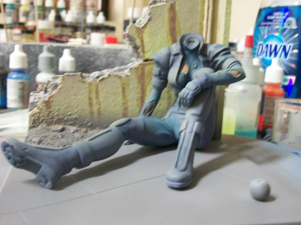
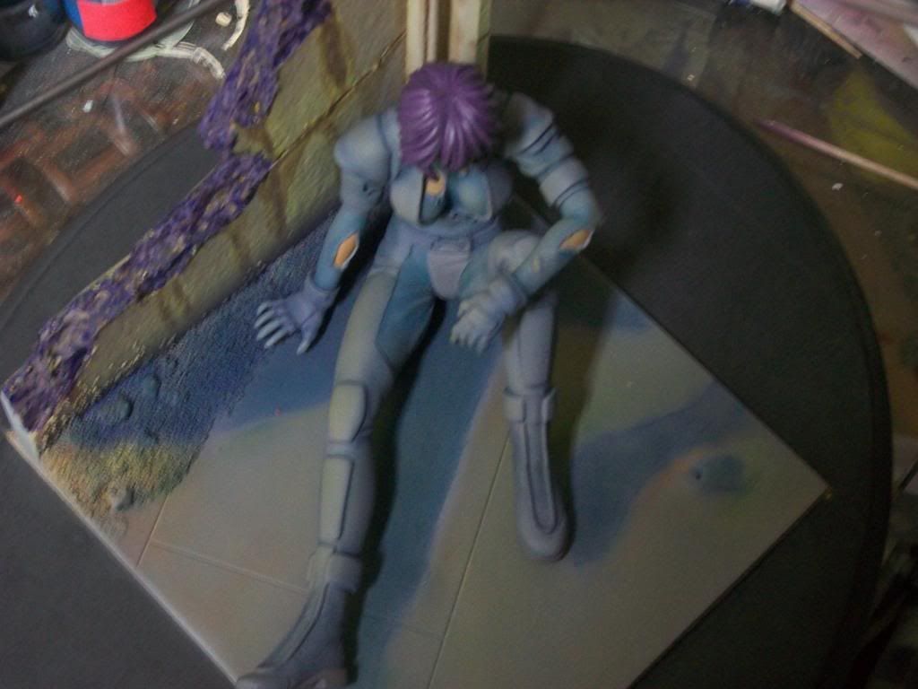
Then we see the figure sitting on the base.
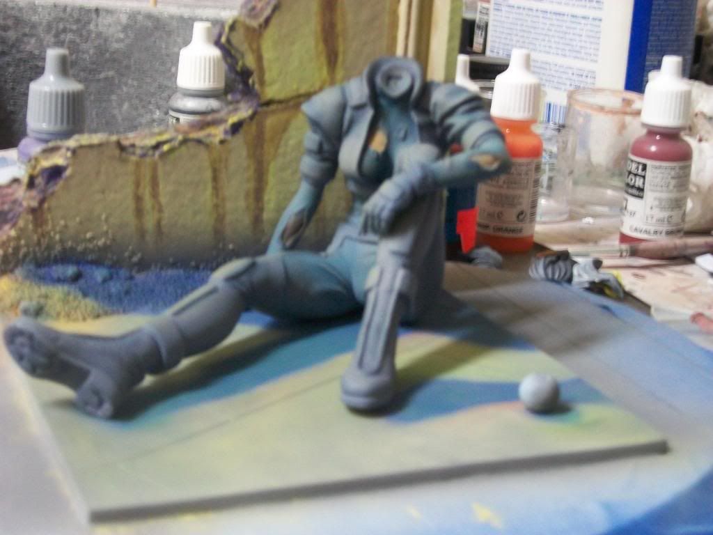
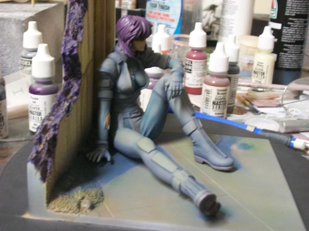
The next picture shows the figure with some painting refinements and the addition of her head and hair. Highlighting and shadowing were completed on the face and the hair using the same procedures outlined above. She has not been glued yet due to further refining that is necessary on the base and the attachment of parts to her torso.
The piece is not finished but, all-in-all, I am pleased with the outcome thus far. I kind of made up the process as I went along but I am heading in the visual direction that I desired.


Okay, the pictures did not post. I will have to figure out how to post the pictures. Crap!
ReplyDeleteFixed the pictures. Check the order, please. See if this is how you want them. I grouped them to save space.
ReplyDeleteThe pictures are close the correct order. Of course I wanted them embedded after each paragraph in the original draft but this looks fine and I hope everyone will see the progression of the work. By the way, what do you think of the piece?
ReplyDeleteAmazing Work Tom!!!! Love the colors you used. I really enjoyed the write up and photos. Looking forward to seeing her in person.
ReplyDeleteI love the piece! I think it's awesome! The model is pretty cool, too. ;P
ReplyDeletePutting pics in between paragraphs is easy. It's just easier to SHOW than TELL. :) I'll work on another "how-to" guide this weekend for everyone that's interested.
I very much enjoyed seeing this in person the other day. Super work with the shadows.
ReplyDelete