With Halloween approaching, I thought it befitting to have a small discussion on horror movies.
Horror films have been around since the advent of motion pictures beginning notably with Edison’s 1910 silent adaptation of Frankenstein. Throughout the years the silver screen has graced us with such notable horror film actors like Lon Chaney Sr., Boris Karloff, Vincent Price, Peter Cushing, and Angus Scrimm.
Horror and monster movies were a big part of my childhood. I remember begging my parents to let me stay up late on Friday and Saturday nights so I could watch Elvira, Mistress of the Dark and Fright Night, both of which aired on a local t.v. station and showcased the horror/sci-fi genre of movies. The coolest part of these movies nights was that it gave this young man quality time to spend with his father. Like most typical young lads of that time, my room was decorated in monster posters, monster magazines and of course my plastic monster models.
Over the years I’ve watched a lot of monster/horror movies, some great, some lame. After some thought, I came up with a list of my all-time favorites:
1. The Pit and The Pendulum (with Vincent Price)
2. The Wolf Man (with Lon Chaney Jr.)
3. Curse of the Werewolf (with Oliver Reed)
4. Curse of Frankenstein (with Peter Cushing/Christopher Lee)
5. The Abominable Dr. Phibes (with Vincent Price)
6. Frankenstein (with Boris Karloff)
7. The Thing From Another World
8. Halloween (John Carpenter’s 1978 original)
9. Phantasm
10. The Shining (with Jack Nicholson)
So there you have it, my top ten horror movies of all time. What’s your fright of choice?????????????
The Undertaker

Heghlu'meH QaQ jajvam
Monday, September 20, 2010
Sunday, September 12, 2010
Craft vs. Art?
Modelers debate whether modeling is a craft or art. Some say that modeling requires skill but is not an art a craft, while others say that modeling surpasses craftsmanship and is art. Art is “the conscious use of skill and creative imagination especially in the production of aesthetic objects” (Webster’s Ninth New Collegiate Dictionary). Art, then, is a process that combines skill (which can be defined as refined technique) with creative imagination to produce an aesthetic object. Being creative is “having the quality of something created rather than imitated.” Some modelers are content with copying objects while others take an object to another level to produce something that is both accurate and true to the object but also adds qualities to the object that make it aesthetically pleasing. Since this is a blog that emphasizes both fantasy and science fiction genres in modeling, let’s focus specifically on those areas. I can’t speak specifically to science fiction since I don’t dwell much in that arena. I believe the essence of Anime/Fantasy figure modeling is to breathe life into in inanimate object (the cast resin, vinyl, or plastic figure) that has as its sole reference point the character and personality of a humanoid of some kind. Breathing life into the object is more than an accumulation of technique. It is an activity of creativity. We start with a figure in which a sculptor has infused personality and character, often in some kind of pose that depicts action and intent. Starting from this base, the model builder expands what has been provided and further builds the personality and characteristics of the figure. Depiction of personality in the painting of a figure requires the skillful application of subtle shading and highlighting to capture and, to a degree, exaggerate the characteristics, mood, personality, and intent of the figure sculpted by the sculptor. Breathing life into a character requires the modeler to render emotions on the face of the figure that are consistent with the pose. The distinction between art and accuracy is important when developing the character of the fantasy/anime figurine because it places into the hands of the modeler the task of taking a figurine and skillfully creating an aesthetic object where “aesthetic” refers to relating to the beautiful. A shift occurs between skill and art, for some, in that the vision and emotional intent of the modeler is communicated between the viewer and the modeler in the form of something that is emotionally pleasing. Whether the piece is an Anime figure or a grotesque monster is not relevant. What is relevant, and what turns the piece from skillful representation, into a piece of art is the emotional exchange that occurs between viewer and modeler through the modeled piece. To this extent, modeling can be both skillful reproduction and art depending on what the modeler creates. What do you all think: Is modeling a skillful reproduction or is it art?
Tuesday, September 7, 2010
Blog Updates!

News flash: The Fellowship Blog has been updated! Rusty has added his pictures to the Member's Gallery. Rusty is an awsome, great, talented, and handsome artist who creates incredible Monsters. He has won many awards at Wonderfest and the Historical Modelers Society in Oklahoma. Take a moment and check out his pictures. They are truly awesome! Tom has added to his gallery: "Summoned Evil." This particular piece was used by him to create a better understanding of color theory. In this case, he wanted to use cool highlights with, as dictated by color theory, warm shadows. His hope was to present a piece that appeared cold hearted and evil! Let us know what you think of these new additions!
Friday's Meeting

A good time was had by everyone Friday night. Josh shared humorous details about his field trip to Rusty's where he learned the basics of using an airbrush. Rusty brought the models that he and Josh used for practice of a "Martian," but the designer of the "Martian" seemed to be clearly influenced by certain parts from nature (hmmmm). Josh did a great job under the supervision of Rusty and we all look forward to seeing more completed pieces! Rusty provided a short description of a method to simulate blood vessals in large scale figure eyes using 20-minute epoxy and yarn. The lone wolf shared with us a new model acquisition and a great smile. Tom brought his Motoko Kusanagi model featured earlier in the blog and explained how he used the color wheel for the selection of general colors and shadows. Ken and Bri shared their wedding rings with the group. They were truly beautiful. Did somebody mention a bachelor party? A visitor and his son participated in the group0. He busily worked on a World War I biplane and added humurous quips to our discussions. The pizza went fast and was enjoyed by everybody. Pictures of our gathering can be seen in the Gallery section of the blog.
Thursday, September 2, 2010
Motoko Kasanagi
What follows is a series of steps of my most recent work in progress. This is Motoko Kusanagi that I purchased from e2046. I am not at all familiar with this anime character but I was interested in exploring a lighting effect with the wall behind her. When I originally saw a finished work of her, I envisioned what she might look like sitting behind that wall at sunset. Her uniform is torn and I pictured in my mind’s eye the wall being a safe haven and the setting sun representing the end of a hard day of fighting. The task ahead of me for this rendition was to show the rays of the setting sun shining on her uniform as she rested behind the wall. The photos are at the end of the written part of this post. I wasn't able to figure out how to post the pictures between the paragraphs. Maybe next time!
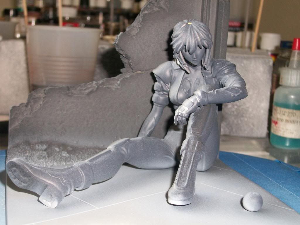
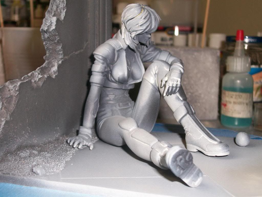
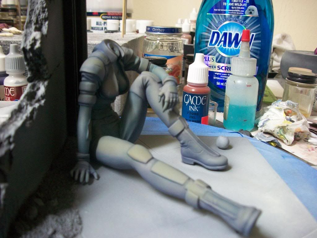
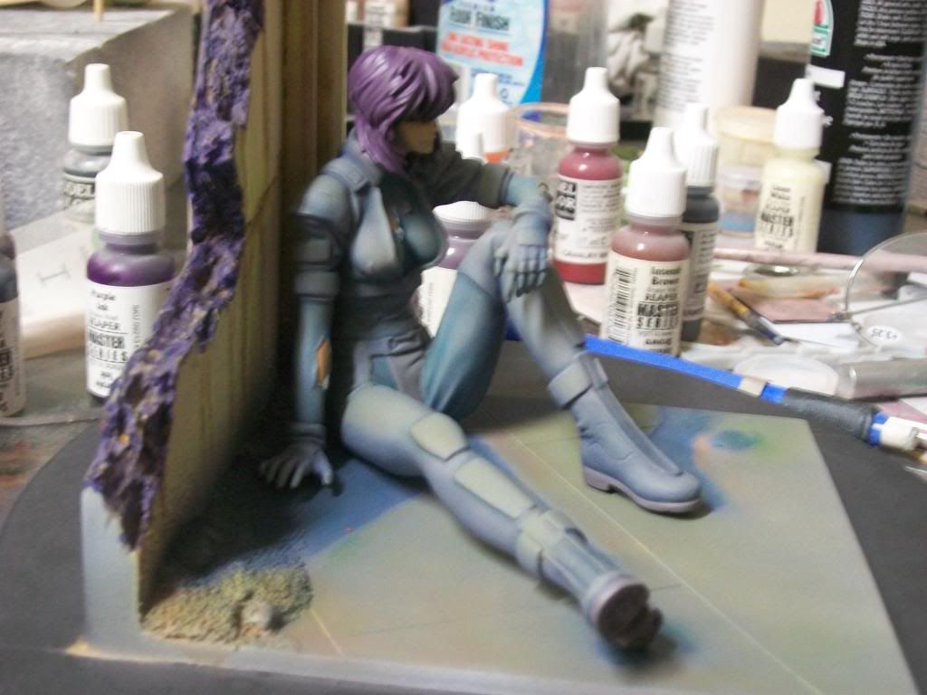
I primed all pieces in black and then sprayed a light white with a yellow tint from the direction that the sun would be shining on her so that I could get a general idea of where the highlights and shadows might fall. The next two pictures show Motoko from the viewer’s side first and then the highlighted side. Please notice the shadows cast by her leg, boot, and apple.
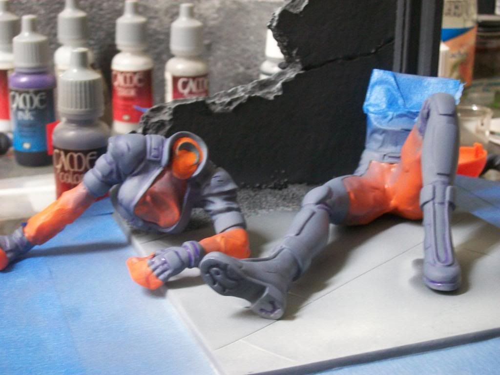
I next base coated the colors of her uniform. The research I completed on the character found her attired in a light grey and dark grey uniform. I amended the color scheme and used Intermediate blue and a warm grey color. A color wheel was used to select a color triad so that all of the colors would look well together. The plan was to use a blue/ purple color of uniform, pale green wall, and red apple as the primary colors of the triad. I applied a purple acrylic ink to the recesses of her uniform as pre-shading to the base coat. Even though acrylic ink dries, when moistened, either by water or paint, it reactivates and tints the applied color. The following picture shows the figure masked with silly putty and the ink applied prior to the application of the Medium Grey.
The next picture shows the uniform basecoat after the Silly Putty has been removed. Notice that the white pre-shading successfully defined the areas of highlight and shadow without me having to do further highlighting/shadowing on the coat. The pre-shading also defined where the highlights and shadows would be in relationship to the sun setting behind the wall.
The next step was to simulate the sunset on her uniform. To accomplish this, pastel chalk was used. The setting sun casts a warm colored glow to objects that it strikes and cast shadows that are of cooler colors. Shadows where applied first with pastel chalk in a variety of dark blue and purple hues. Then the highlights were added using chalk of light yellow, orange-yellow, and orange to simulate the warm range of light as it strikes an object. Chalk has transparent properties so it acts as a tint of the base color which influences the base color hue. Pastel chalk was scraped off of the chalk sticks, applied with a paint brush, and then blended with a flat brush. Once the desired affect was achieved, the pastel chalk was sealed with a light coat of Testor’s Dullcoat. The following two pictures show the end result of the calk process on the figure.
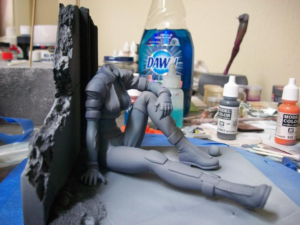
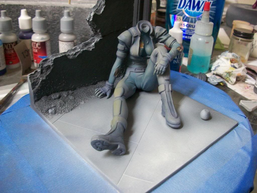
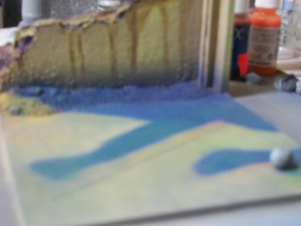
The next step was to work on the wall and floor. I painted the wall a light green to accentuate the peaceful mood of the piece and as one of the triadic colors with the blue/ purple color of her uniform. It was applied over a Dark Orange-Red color and hair spray was applied over the darker color once it had dried. The dark red color was used to bolster the mood of violence and war that was peaking behind the moment of peace experienced by the character and is the third member of the color triad. The green was removed in areas, simulating the wearing of the paint due to water drainage on this broken down wall; revealing the reddish paint below. Sepia ink was applied to represent water stains and show the course of water as it fell over the wall. The floor was painted Medium Grey to represent a concrete floor. The picture below shows the completed wall with the figure sitting in front.
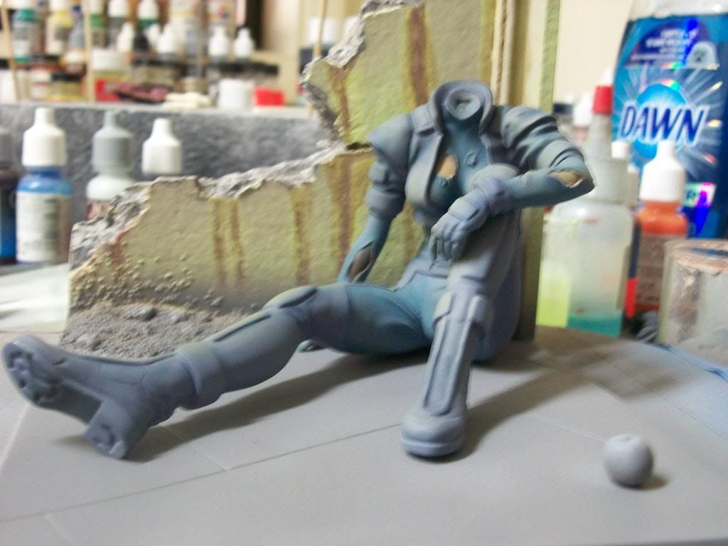
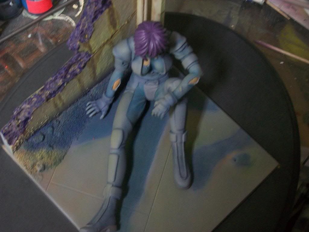
The next step was to render the highlights and shadows on the floor and wall. Shadows on the wall were completed by adding red to the green mixture, dulling in down, and spraying a pattern on the wall to represent shadow. I left the area directly behind the figure fee of shadow. A lighted figure reflects light which would fill in the darkness behind the figure. Visually, I wanted the wall to act as a kind of halo around the figure so the figure would pop out of the piece. I then took a high intensity light and directed over the wall toward the figure and quickly sketched where the shadows fell. The same sets of pastel chalks used on the figure were applied to the floor. It was important to continue the theme on the floor so that a context would be supplied for the shading of the figure. The shadow cast from the figure, however looked too dark, so I added green to the shadow to create a teal color that softened the shadow some. The round object by her foot is an apple. I don’t know the importance of the apple, but it seems to be something that is common for this character. It also needed to cast a shadow. The next picture shows the base highlighted and shadowed using the above process. Please excuse the blurry picture. This process on the base took approximately 45 minutes to complete, which does not seem like a very long time when compared to the amount of time I spent working on cleaning up seams. In fact, all of the pictures shown represents one weekend of work.
Then we see the figure sitting on the base.
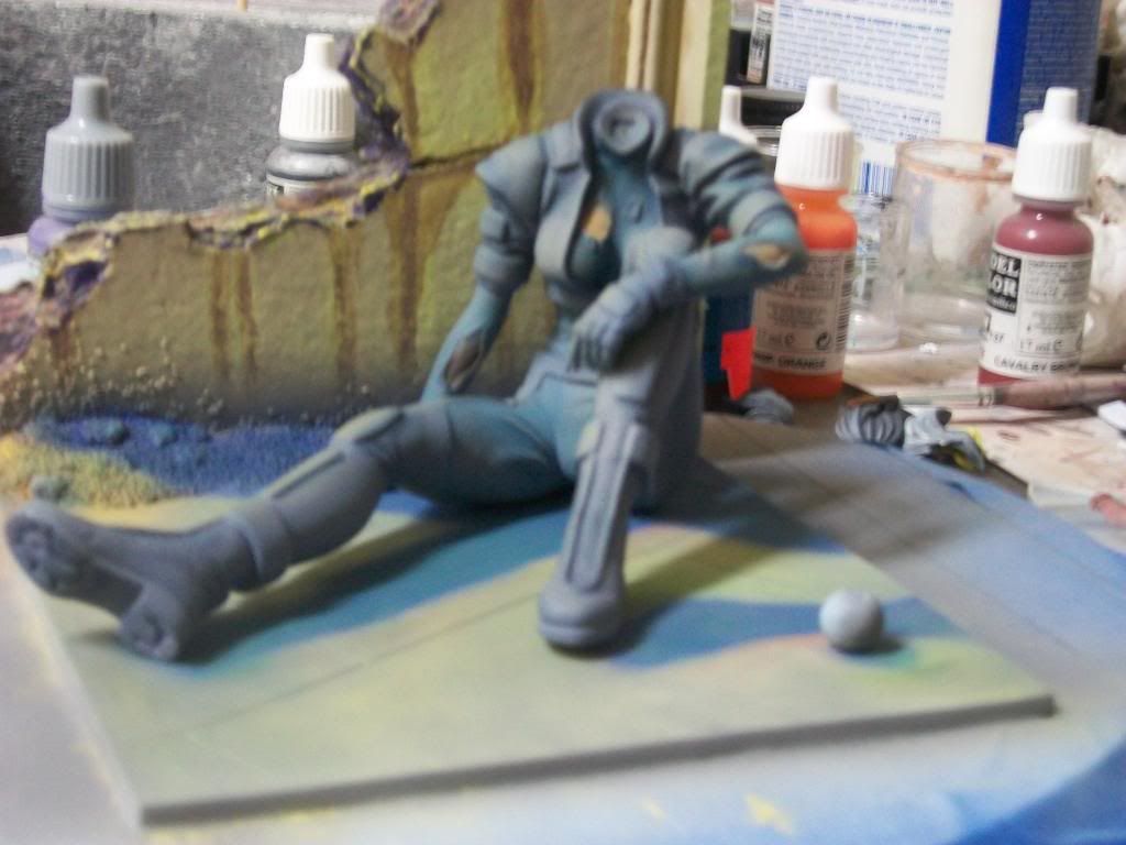
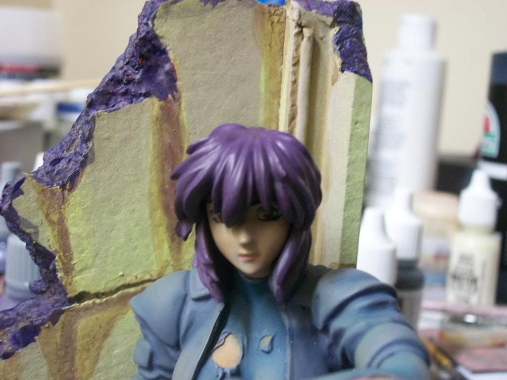
The next picture shows the figure with some painting refinements and the addition of her head and hair. Highlighting and shadowing were completed on the face and the hair using the same procedures outlined above. She has not been glued yet due to further refining that is necessary on the base and the attachment of parts to her torso.
The piece is not finished but, all-in-all, I am pleased with the outcome thus far. I kind of made up the process as I went along but I am heading in the visual direction that I desired.


I primed all pieces in black and then sprayed a light white with a yellow tint from the direction that the sun would be shining on her so that I could get a general idea of where the highlights and shadows might fall. The next two pictures show Motoko from the viewer’s side first and then the highlighted side. Please notice the shadows cast by her leg, boot, and apple.
I next base coated the colors of her uniform. The research I completed on the character found her attired in a light grey and dark grey uniform. I amended the color scheme and used Intermediate blue and a warm grey color. A color wheel was used to select a color triad so that all of the colors would look well together. The plan was to use a blue/ purple color of uniform, pale green wall, and red apple as the primary colors of the triad. I applied a purple acrylic ink to the recesses of her uniform as pre-shading to the base coat. Even though acrylic ink dries, when moistened, either by water or paint, it reactivates and tints the applied color. The following picture shows the figure masked with silly putty and the ink applied prior to the application of the Medium Grey.
The next picture shows the uniform basecoat after the Silly Putty has been removed. Notice that the white pre-shading successfully defined the areas of highlight and shadow without me having to do further highlighting/shadowing on the coat. The pre-shading also defined where the highlights and shadows would be in relationship to the sun setting behind the wall.
The next step was to simulate the sunset on her uniform. To accomplish this, pastel chalk was used. The setting sun casts a warm colored glow to objects that it strikes and cast shadows that are of cooler colors. Shadows where applied first with pastel chalk in a variety of dark blue and purple hues. Then the highlights were added using chalk of light yellow, orange-yellow, and orange to simulate the warm range of light as it strikes an object. Chalk has transparent properties so it acts as a tint of the base color which influences the base color hue. Pastel chalk was scraped off of the chalk sticks, applied with a paint brush, and then blended with a flat brush. Once the desired affect was achieved, the pastel chalk was sealed with a light coat of Testor’s Dullcoat. The following two pictures show the end result of the calk process on the figure.
The next step was to work on the wall and floor. I painted the wall a light green to accentuate the peaceful mood of the piece and as one of the triadic colors with the blue/ purple color of her uniform. It was applied over a Dark Orange-Red color and hair spray was applied over the darker color once it had dried. The dark red color was used to bolster the mood of violence and war that was peaking behind the moment of peace experienced by the character and is the third member of the color triad. The green was removed in areas, simulating the wearing of the paint due to water drainage on this broken down wall; revealing the reddish paint below. Sepia ink was applied to represent water stains and show the course of water as it fell over the wall. The floor was painted Medium Grey to represent a concrete floor. The picture below shows the completed wall with the figure sitting in front.
The next step was to render the highlights and shadows on the floor and wall. Shadows on the wall were completed by adding red to the green mixture, dulling in down, and spraying a pattern on the wall to represent shadow. I left the area directly behind the figure fee of shadow. A lighted figure reflects light which would fill in the darkness behind the figure. Visually, I wanted the wall to act as a kind of halo around the figure so the figure would pop out of the piece. I then took a high intensity light and directed over the wall toward the figure and quickly sketched where the shadows fell. The same sets of pastel chalks used on the figure were applied to the floor. It was important to continue the theme on the floor so that a context would be supplied for the shading of the figure. The shadow cast from the figure, however looked too dark, so I added green to the shadow to create a teal color that softened the shadow some. The round object by her foot is an apple. I don’t know the importance of the apple, but it seems to be something that is common for this character. It also needed to cast a shadow. The next picture shows the base highlighted and shadowed using the above process. Please excuse the blurry picture. This process on the base took approximately 45 minutes to complete, which does not seem like a very long time when compared to the amount of time I spent working on cleaning up seams. In fact, all of the pictures shown represents one weekend of work.
Then we see the figure sitting on the base.
The next picture shows the figure with some painting refinements and the addition of her head and hair. Highlighting and shadowing were completed on the face and the hair using the same procedures outlined above. She has not been glued yet due to further refining that is necessary on the base and the attachment of parts to her torso.
The piece is not finished but, all-in-all, I am pleased with the outcome thus far. I kind of made up the process as I went along but I am heading in the visual direction that I desired.


Wednesday, September 1, 2010
Meeting Friday!
Come check us out at HobbyTown USA this Friday, September 3rd at 6:00 pm. For directions, see the map at the bottom of this page. Have questions? Leave a comment or go to the "Contact Us" tab and send us a message! We're having pizza Friday. Looking forward to good times and fellowship. Hope to see you there!
Subscribe to:
Posts (Atom)